
Magnified Vision
Local brick-and-mortar business serving customers with low vision and blindness.
Before

Home page was cluttered with competing messages and design elements.

The entire websites was not responsive, which made most pages difficult to navigate on mobile devices.

The long blocks of text on product pages made deciphering the important information challenging.

Most images across the site focused on objects instead of people, reducing engagement.
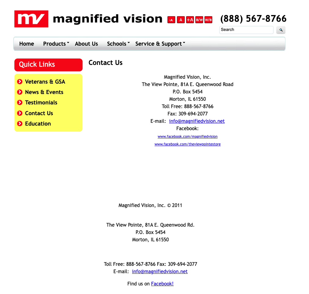
Contact Page had outdated information like a fax number and unused Facebook profile.
After
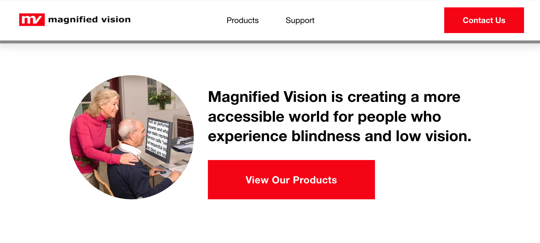
Home page presents a simplified design for easy navigation and a clear call to action.
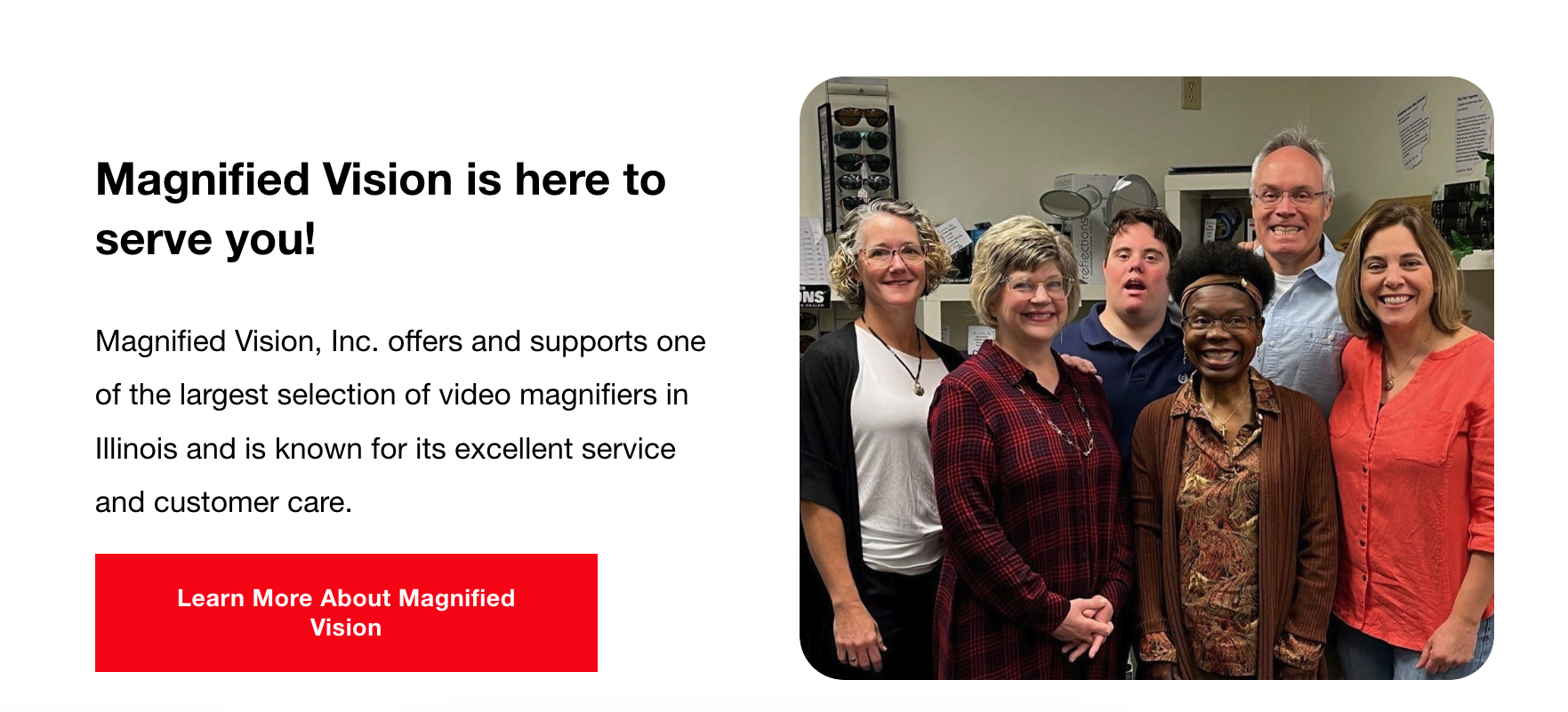
Images across the site now emphasize person-to-person interactions instead of physical products.

High contrast colors, large type, and large images help serve the business's target demographic of people with low vision and blindness.
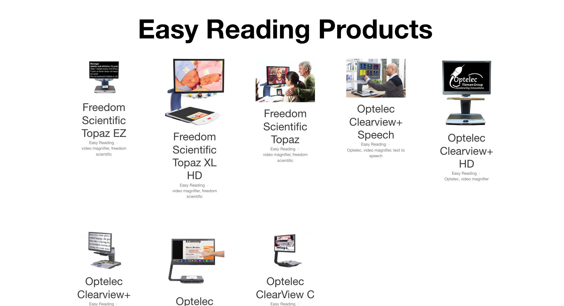
Product navigation centers around images of products instead of a list of text.

Individual product pages lay out details about the product with standardized headings and consistent design elements.
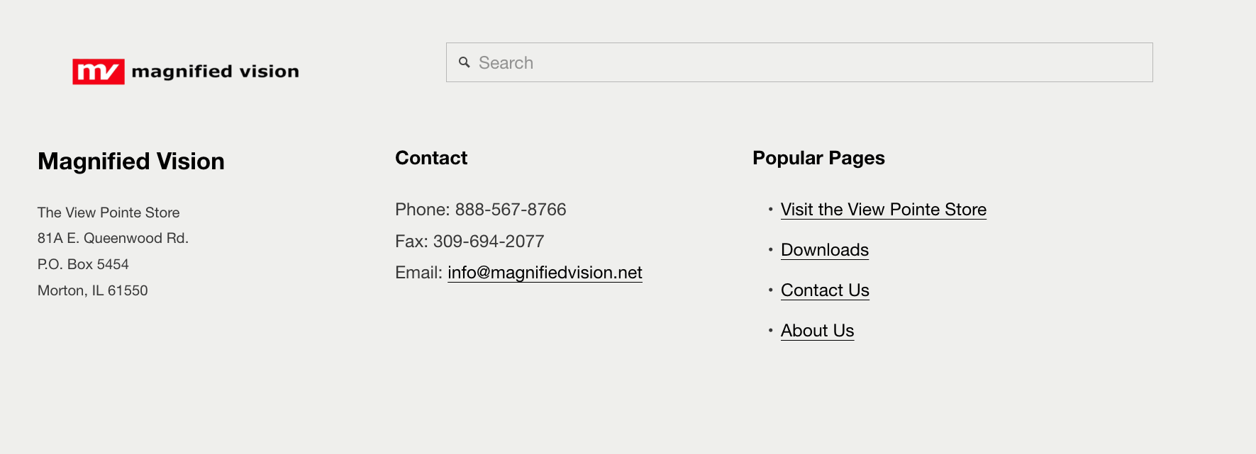
Updated footer allows for easy navigation to high priority pages and static contact info.
Get your own engaging, professional website.
Or send me an email to get started: kyle@cultivatormarketing.com